How to Choose the Best Product Background Color in 2025?
- March 10, 2024
Do you know? About 63% of consumers stated that “high-quality product photos” are very important to decide whether or not to buy a product online (Source: Adobe). That’s why you must know how to choose the best product background color.
Backgrounds can sometimes become tricky to cover. As an aspiring product photographer, you must know which background blends best with your products. Otherwise, it’s a mishap.
Here is why, imagine a common scenario, where you are shooting a white product. And if you select a white background or grey, it is not going to suit very well with your product. And yes, as a promising photographer, you must also know about color codes.
Fear not! If you are a clean slate here, we can help you with all the information you need. Today, we will explore the options for selecting the best background colors for your photos. Let’s hop in, yeah?
Why Does Background Color Matter?

One of the undeniable factors in photography is color. Shoot however you want and in different setups, as you may, without a proper color balance, it’s ideally not possible to shoot the best.
A pleasing color, in fact, can lift your client’s mood. And you may get more clients. Here’s why background color is important for products.
Perfect colors can often affect how your customer sees the products. It influences their behavior and conception. The right color can often highlight the details of your products and deliver an elite blow. It often works with emotion too and may trigger buyer instinct.
Although people have to further inquiry to learn about the qualities and features of your products the right color does take them to this point.
Always use proper color combinations to make your products more attractive and of course open for sale. Let’s not forget colors also help in the development of your brand identity and impression.
Always try to influence your audience with colors. It’s a wise trick to trigger your customer’s buying decision and so on. Let’s just say, that color is one of the fundamental decision-triggering processes.
The right color always promotes a soothing buying mood and prospects are mostly happy. That’s how you can create brand royalty with the use of the right colors.
How to Choose the Best Product Background Color?
As soon as you select a product backdrop color, consider the product’s color, shape, and size, as well as the overall brand appeal. The backdrop color should match the product and help it stand out without being too distracting. Furthermore, consider the environment in which the product will be utilized, as well as the feelings you want to transmit to your target audience.
1) Product Color

The most contradictory fact is the product’s color. It can be a nightmare or a dream come true depending on what you select for your product. Analyze your product’s color and texture, as well as how it will appear against various backdrop colors.
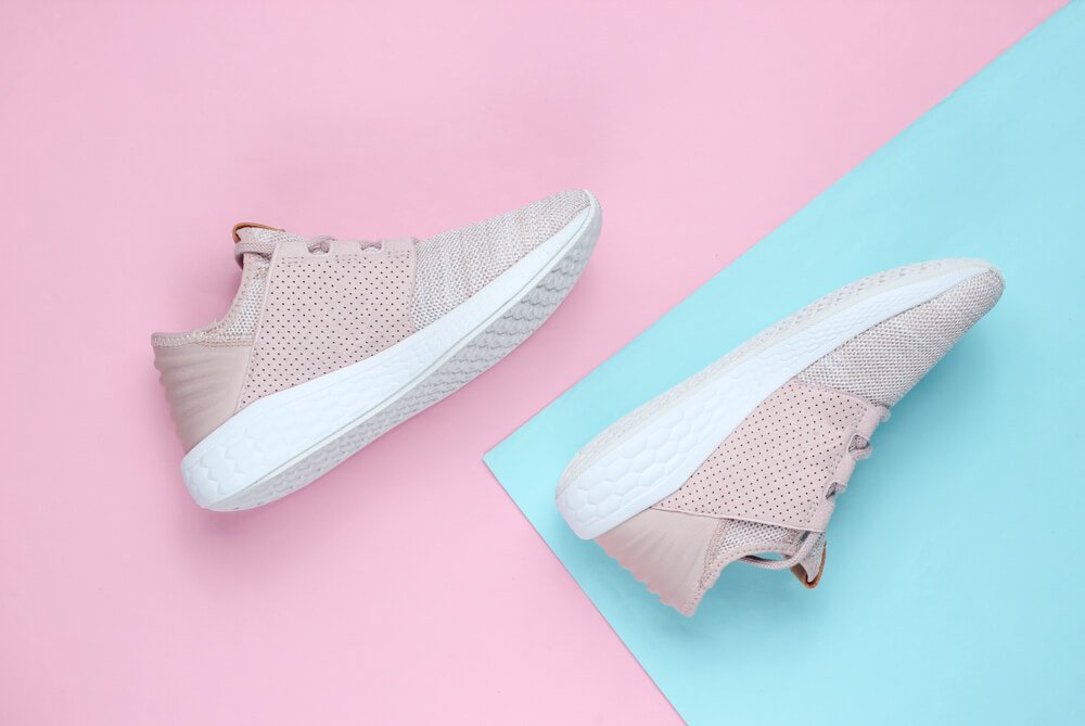
Here is an example to smooth things down for you. If you’re shooting a dark-colored object, using a light backdrop color like white or light grey would help it shine out. In contrast, if you’re shooting light-colored goods, a darker backdrop color, like black or dark grey, will provide a beautiful contrast. However, it does not have to stop with black, white, or grey.
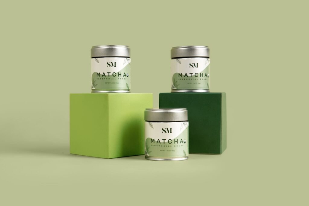
Something else to keep in mind is the design of your product. If you shoot antique or rustic goods, choose a neutral or earthy backdrop color like beige or brown to accent it. On the other side, if you’re shooting a current or fashionable object, a strong and vibrant backdrop color like red or blue can be more acceptable.
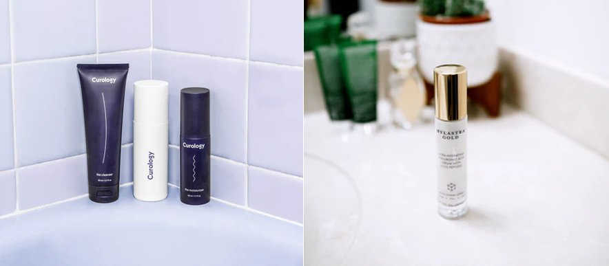
What do you want to photograph? You can have greater freedom with background choices. You might utilize bokeh blurred backdrops, flowers, or even a human backdrop, as seen in jewelry.
2) Light: Natural Or Artifical?
Light is magic. And in combination with the right color, it’s even fantastic. The lighting you use in product images can also influence how the backdrop color appears. If you use natural light, the color of the backdrop may vary based on the time of day and weather conditions. For example, a white backdrop might look warmer or colder depending on the time of day.
You can use also artificial lights. In this case, you may change the look of your backdrop colour by positioning the lights with respect to the object.

Such as a tiny product light shining from the side, front, or rear many feet away from a white background might make the background look dark grey. If the backdrop is equally well-lit, the result is a clear, pure white. Similarly, when lighted, a black backdrop may look glossy or dark grey rather than deep matte black. Again, this depends on the product’s location and the lighting. If your product is small, try using a light tent to diffuse and disperse the light evenly.
3) Spot!
When selecting the ideal backdrop color for your product shot, keep the intended usage in mind. Will the photo appear on a website, in a catalog, or in print advertisements? Each media has various color requirements and limits, so select a backdrop color that will function well in all of them.
The backdrop color of each product photo you take for a catalog or print advertisement should be the same. This will produce a consistent appearance and make the items stand out. If you’re displaying the photo on a website, you may be able to experiment with different backdrop colors to make the product stand out and capture the viewer’s attention.
Is the product visible enough on a plain white or black background? Are shadows required? Does the product have its own color values? You may make your product photos monochrome, comparable, or complementing. Your color scheme may make or break your product picture.

4) Don’t Miss Out on Your Brand
You must always be in touch with your brand. Is there a particular trademark color connected with the product? Colors and design should be considered while selecting the ideal backdrop color for your product shot. Consider your brand’s color palette and how it might be used in product photography. Using the brand’s colors will help you establish a consistent and recognizable appearance throughout all of your product photos.
Such as Coca-Cola or Cadbury Chocolate; the color and script are instantly recognizable. But it isn’t only well-known brands. Smaller organizations may have already established a style guide, so check with the customer first. If they do not have a style guide, you might offer to build one for them as an upsell.s
5) Is It for Prints?
You must already know, that prints and digital media are different. Print signs, catalogs, and brochures have not gone away. Many firms continue to rely on them in their marketing initiatives.
A clean white background is ideal for displaying your product’s features and colors, whereas contextual lifestyle images help customers visualize how they may use your product. For example, DIY and home improvement company B&Q incorporate both into their brochures.
Since you are here for a background tour, learn more about,
- How to Create a White Background in Photoshop: 8 Simple Hacks
- Background Removal by Hand or With AI Which One is Better
- How to Change The Background For A Photo 2025: Basic Guide
- How Can I Remove The White Background From An Image: 2025 Guide
- Car Background for Photo Editing – Tips and Tricks for Stunning Car Photos
- How to Choose the Best Background for Jewelry Photography
Final Words
It might be difficult yet very important to choose the right backdrop color for your product shot. The backdrop color may give your goods a professional appearance while also drawing attention to them in the photograph. When selecting a backdrop color, keep in mind your brand, target demographic, product, and platform on which the photo will be shown.
Experiment with different colors and think imaginatively to let your product stand out. By following these steps, you may select the ideal backdrop color for your product shot and create great photographs to help your product stand out in a competitive market.
