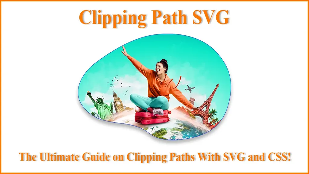
Clipping Path SVG − The Ultimate Guide on Clipping Paths With SVG and CSS!
- March 8, 2025
Clipping is a feature of SVG that enables us to hide an object/element or portions of it in an image, fully or partially, by the use of various kinds of shapes. A clipping path SVG is one such feature that allows you to ‘clip ‘objects into different types of shapes. While SVG and CSS have a lot in common, quite a few features have been imported to CSS from SVG. In this article, we’ll discuss how to draw an SVG image clip path, as well as drawing clipping paths with a CSS property.
Let’s get started!
What Is a Clipping Path?
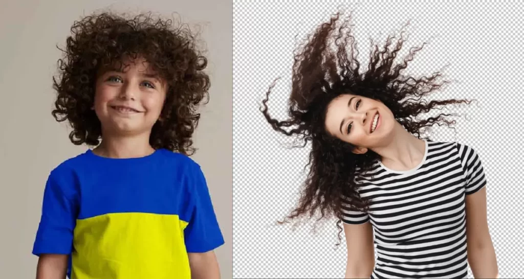
Clipping refers to the graphical operation with which you can hide an object or just a portion of it. The portions that are hidden or shown are determined by the clipping path that is drawn.
In simple words, a clipping path defines the region where everything inside it is visible on the canvas, and everything outside the path is ‘clipped out‘ and not shown on the canvas.
A clipping path can include all types of graphical content, including borders, outlines, text decorations, and backgrounds.
Conceptually, a clipping path in SVG is similar to a custom viewport for the object it is applied to. While it controls which parts of the object are rendered, it doesn’t affect the object’s geometry.
Differences Between Clipping and Masking in SVG and CSS
Masking in SVG or CSS enables us to apply complex shapes with differing opacity over other objects in an image. It is used to produce attractive visual effects while also not being CPU-intensive.
For example, animating gradients requires a lot of computational power. But by animating a mask rather than the gradient, the same visual effect can be obtained, which isn’t as CPU-intensive as animating the gradients.
On the other hand, an ‘<clipPath>’ in SVG, or a clipping path in CSS, is a way to cut one shape out of another. Parts of an object within a clipping path will be visible, and portions outside the path will not be visible.
As clipping relies on the geometry of the path drawn, some visual elements are not applied, such as gradients, fill colors, stroke, and stroke styles.
Clipping in SVG
When working with SVG, you’ll have to use the clipPath element to specify the clipping path on elements.
An SVG clipPath can consist of any number of shapes, paths, and tags. It can also accept animation tags, including <animate> and various SVG shapes, such as circles, rectangles, and polygons. This can be incredibly useful for creativity.
It is also possible to define multiple child clipPaths within a parent clipPath.
Creating Clip Path
Since our goal is to keep this guide simple, we’ll not indulge in a lot of code. Instead, we’ll use a simple example of drawing a clipping path on a ‘circle’ element.
With a ‘circle’ element on the canvas, we can draw a clipping path to create a semi-circle from it with the following code-
<svg>
<defs>
<clipPath id=”cut-out-bottom”>
<rect x=”0″ y=”0″ width=”200″ height=”100″/>
</clipPath>
</defs>
<circle cx=”100″ cy=”100″ r=”100″ clip-path=”url(#cut-out-bottom)”/>
</svg>
In the code above, the clip-path attribute refers to a clipPath element with a single rectangular element.
The ‘rect‘ element determines which pixels from the circle will be visible in the final render.
As the rectangle doesn’t cover the lower half of the circle, only the upper half will be visible, while the lower half is omitted.
Clip Path Attributes
A clipPath element can contain multiple attributes, such as class and id, as well as presentation attributes, including but not limited to stroke and fill. Among all the attributes, the most useful one is the clipPathUnits attribute.
A clipPathUnits attribute specifies the coordinate system for the contents inside the drawn clipPath. It stores two variables: userSpaceOnUse and objectBoundingBox.
The userSpaceOnUse is used to specify which coordinate system is active and how to define how the lengths and coordinates are computed.
For SVG elements, the default user coordinate system has the origin located at the top-left corner of the viewport that is nearest to the element.
On the other hand, an objectBoundingBox enables us to apply clipping paths to the boundary of an element itself and not on the coordinate system being used.
In simple words, it is a literal ‘bounding box’ for containing the element’s geometric shape.
The key difference between the two variables is that for userSpaceOnUse, the clipping path is drawn within the specified coordinate system.
For objectBoundingBox, the box over the image is used as the coordinate system for the clip path.
Clipping in CSS
In CSS, the clip-path property specifies how the clipping path applies to an element. With clip-path, an SVG clipPath can be applied to an element by referencing it within the clip-path property.
Since we’re focusing more on SVG in this article, we’ve tried keeping the code as minimal as possible.
That being said, here is the CSS code for applying a clip path by referencing an SVG clipping −
/* Referencing an SVG clipPath */
.element {
clip-path: url(#svgClipPathID);
}
/* Using a CSS basic shape function */
.element {
clip-path: polygon(…); /* or one of the other shape functions */
}
We can use different types of shapes other than a polygon, such as a circle, ellipse, inset rectangle, and more.

Testing Browser Support When Clipping and Masking With SVG or CSS
Before committing entirely to this alternative method of working with graphics, it is crucial to note that browser support is not always consistent with masking and clipping.
While clipping is widely more supported, CSS masks have fairly limited support.
Therefore, testing and seeing if your clippings and masks are supported is recommended.
Before trying them in various browsers, you can test your work at Codepen or JSFiddle.
Although browser support has been increasing throughout these years, it is still a good practice to test things out before delivering your graphics to the masses.
Conclusion
With all of that being said, you should now be familiar with clipping path SVG. In this age of rising web graphics, we can reduce our dependence on image editors and modify images more effectively directly from the browser. We hope to have helped you with this article on the SVG image clip path! To know more about Clipping Path, follow our articles regularly.